isolved Brand System
Telling a more human story for an HCM brand.
CATEGORY
Brand Systems
Logo Design
Print Design
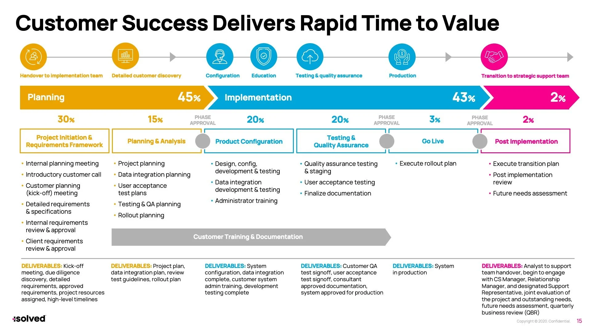
Presentation Design
Social Media Design
Web Design
OPPORTUNITY
This human capital management company was in the process of restructuring its offerings and products while looking to reset its perception within the industry. Mostly focused on selling its solutions to small- to mid-sized companies, the brand was struggling to maintain relevance in a rapidly changing industry full of competition. Though the brand name retained years of equity, they were desperately seeking a refresh to its platforms, systems and perceptions for potential customers.
PROCESS
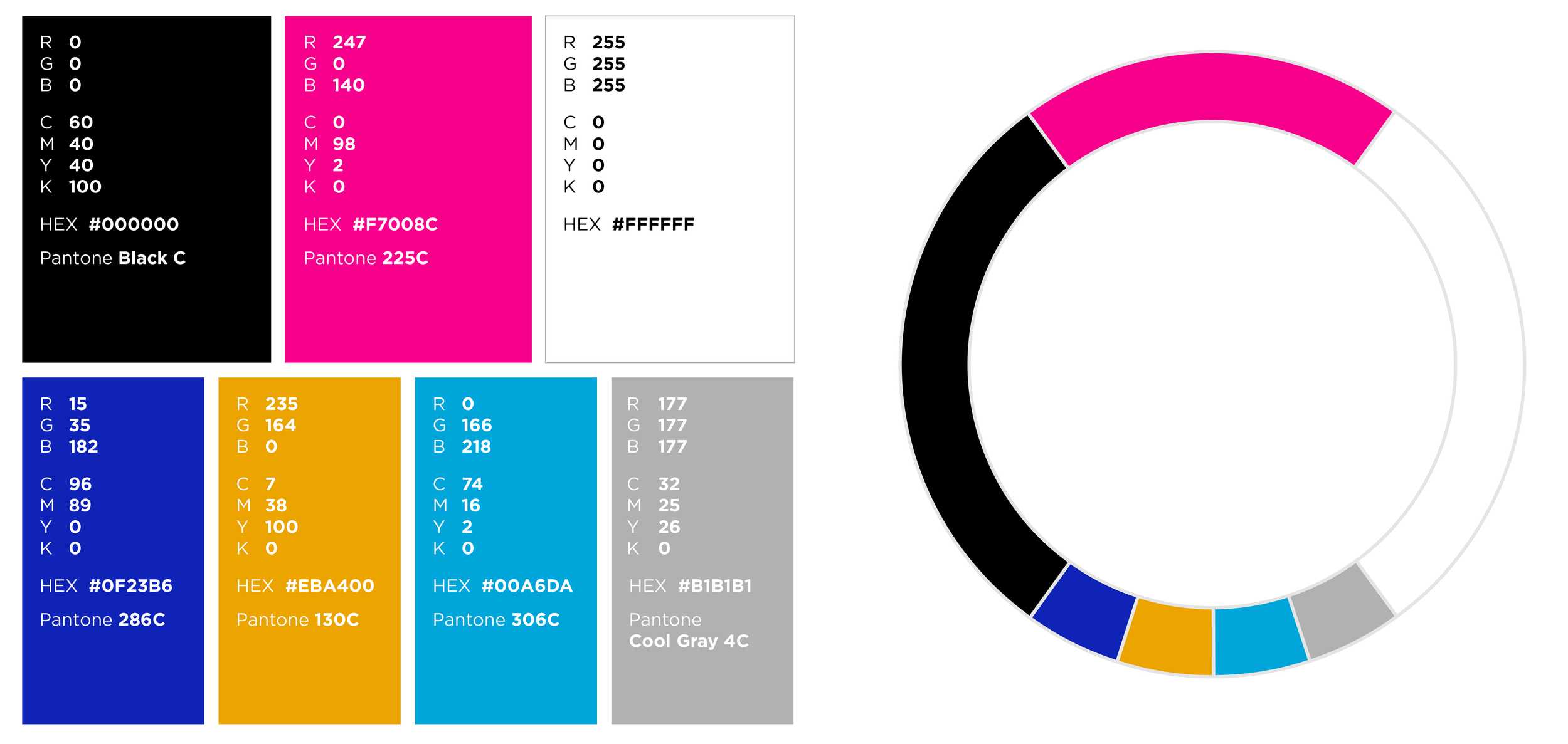
After discovery and strategy sessions came to a close, the concept of ‘people first’ became imminently clear as a main brand focus. The brand, though selling solutions that are historically workforce-focused, wanted to ensure that the human was still at the center of their HCM story. After refreshing their logomark to incorporate shorter, tighter letterforms and a visual identifier for individuals, a brighter color palette was created to allow them to stand out from competition.
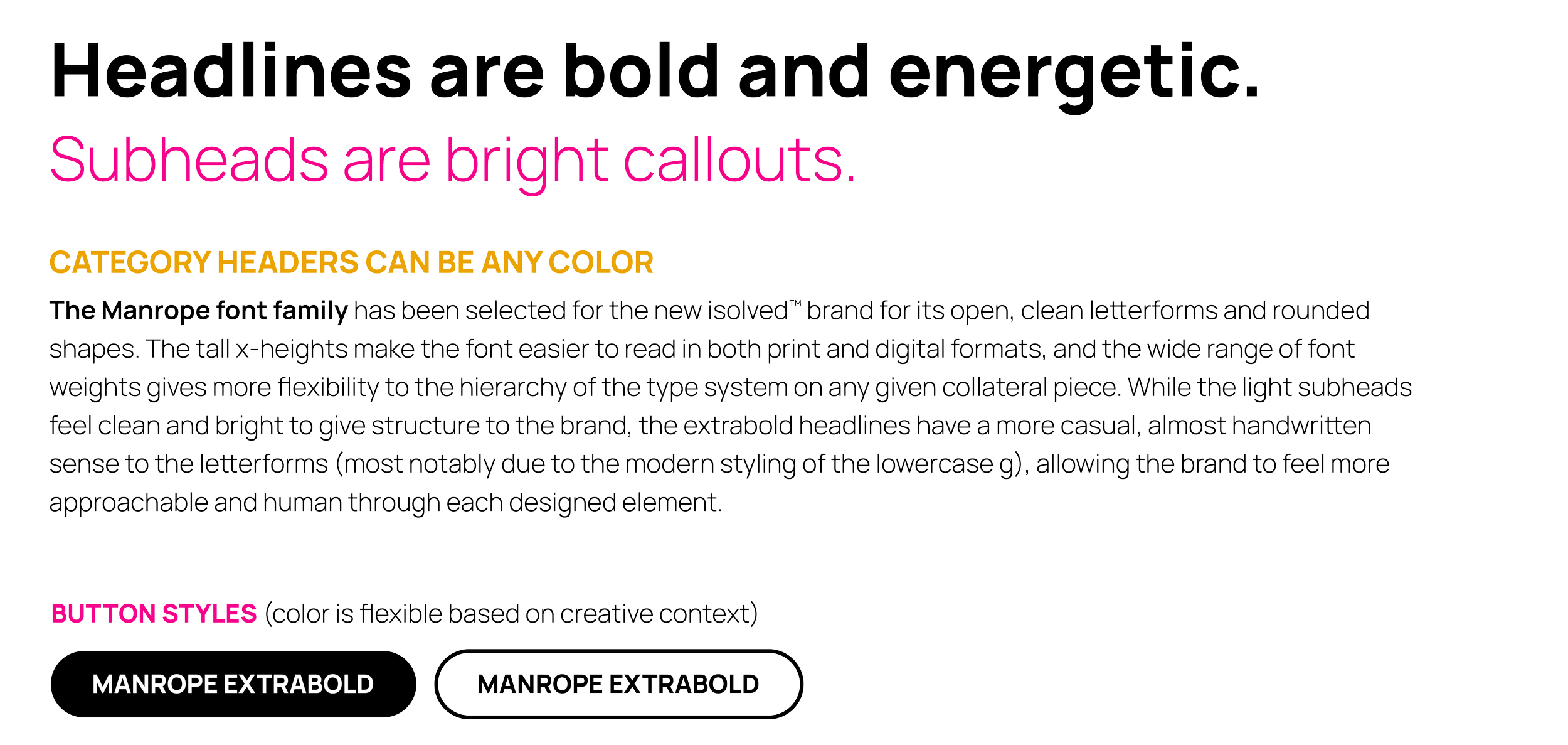
I then created a series of patterns that brought the human work-life experience to illustrations, selected a more approachable and human typeface, created a series of iconography and photography styles, and presented everything together through an updated Brand Toolkit and accompanying collateral materials. Lastly, I worked with our UX lead to build a web design concept for several of their site pages to help introduce their newly designed brand to the world.
FINALIST — 2021 AMY Awards, Visual Branding/Identity
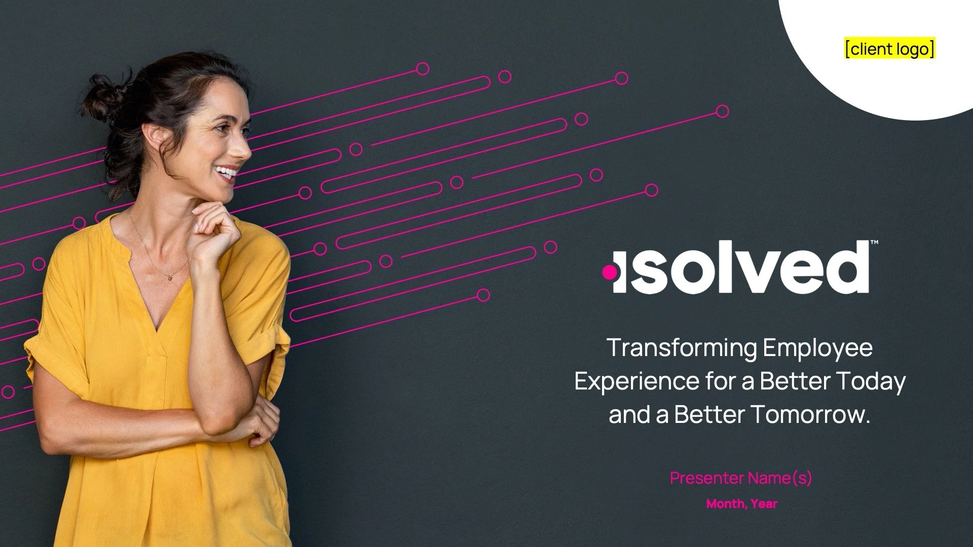
Refreshed logo
The new logomark is a tighter, bolder form with slightly rounded edges to feel more approachable and human, removing any clunky ascenders and capital letters. The pink dot on the ‘i’ became a visual representation of the human at the center of the brand story.
Core brand assets
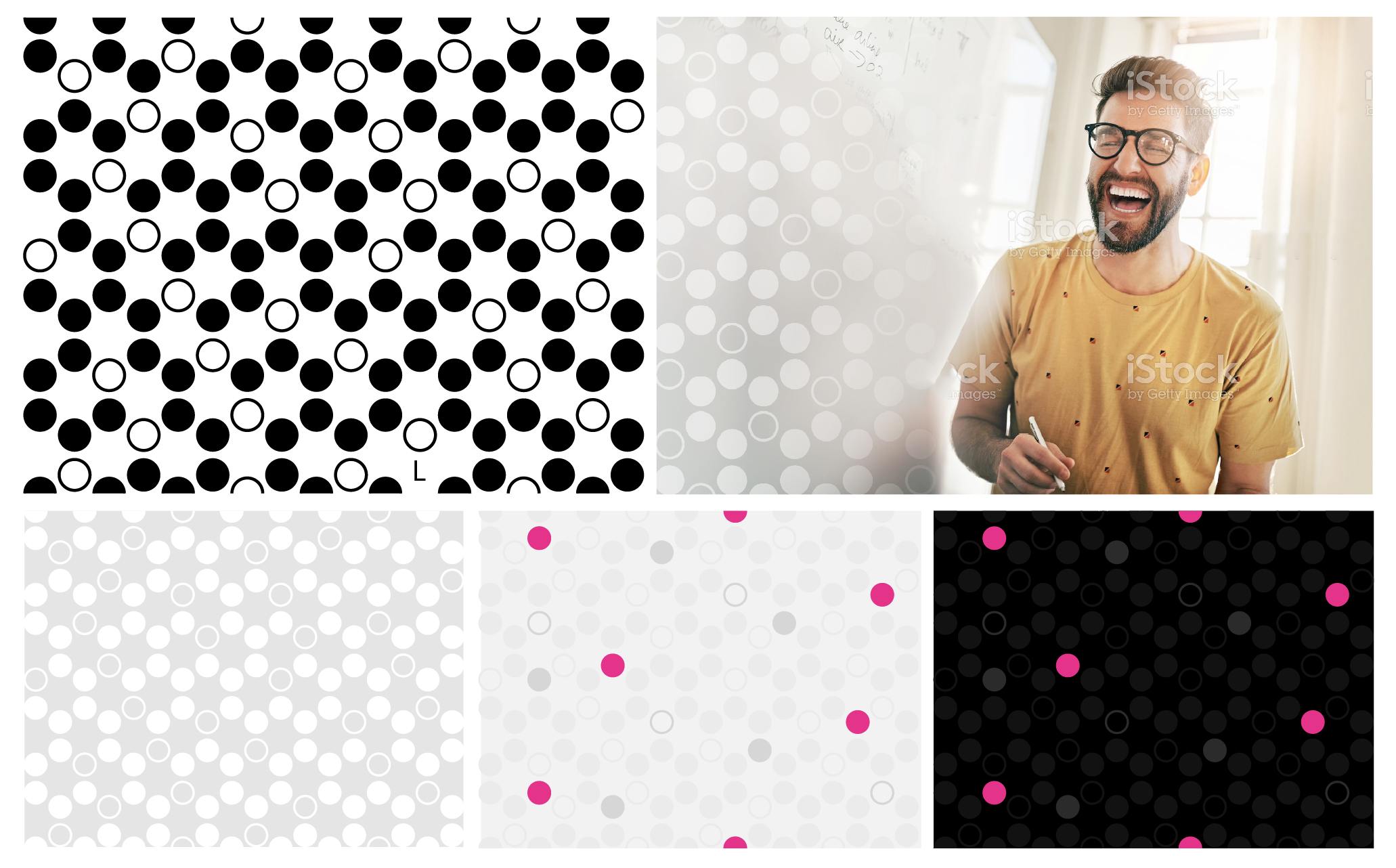
The Hive Pattern was designed using the isolved brand circle, where each circle represents a unique employee within a larger company. Built in a hexagonal, honeycomb-like structure, the Hive represents the collective strength and intelligence of a group created from its individual parts.
Brand patterns
Each of the three brand patterns is focused on the idea of a bee and its productivity to the larger hive. Reminiscent of a collective of hardworking individuals, each pattern can evoke a unique feeling depending on the context of the piece or the story being told.
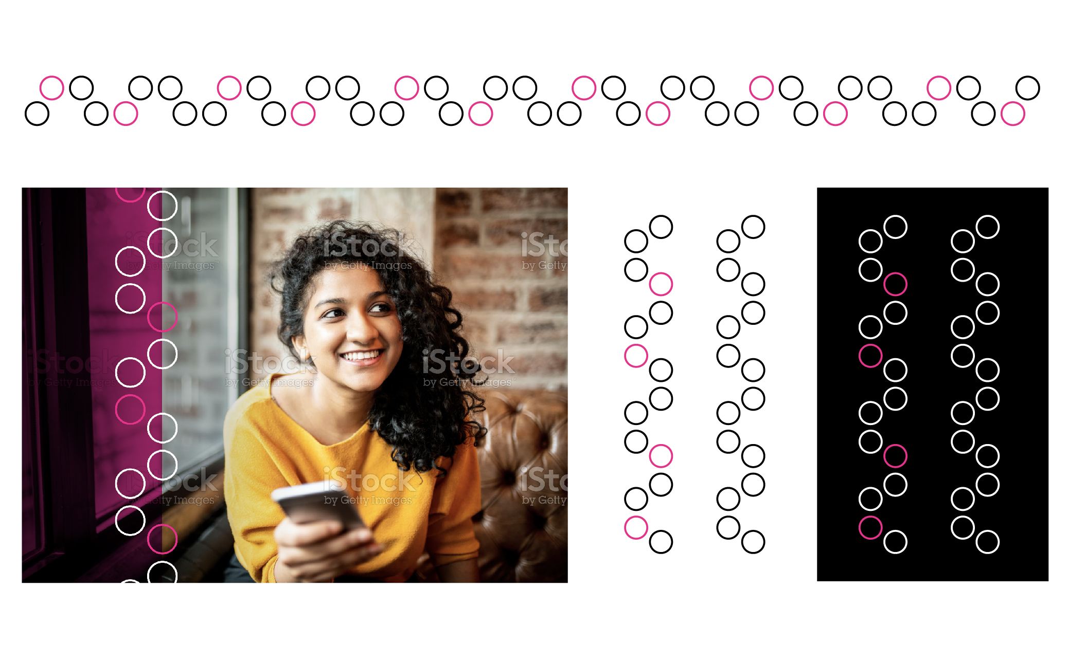
The Beeline Pattern can be used horizontally or vertically to highlight a certain image with text or as a singular graphic overlay on some creative pieces where the larger hive pattern would be too overpowering.
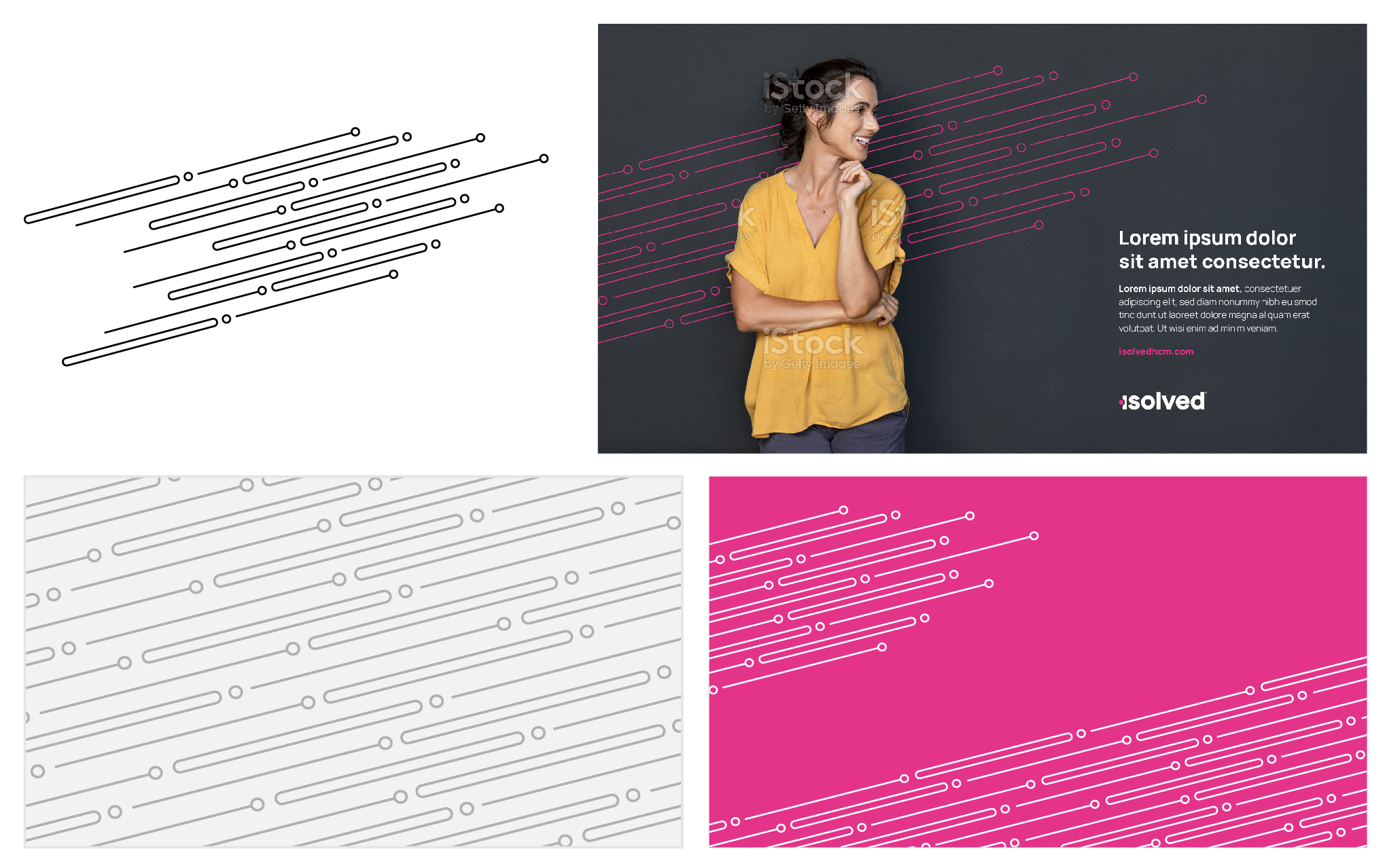
The Swarm Pattern should always be used at a 15° upward angle to give energy and forward momentum to otherwise static images or graphic areas. It can be used behind images of people to show upward growth and climbing to new heights, or be used as a subtle background element against solid colors to add a dynamic flair.
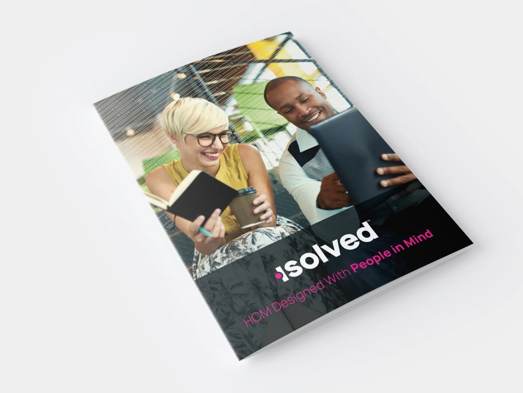
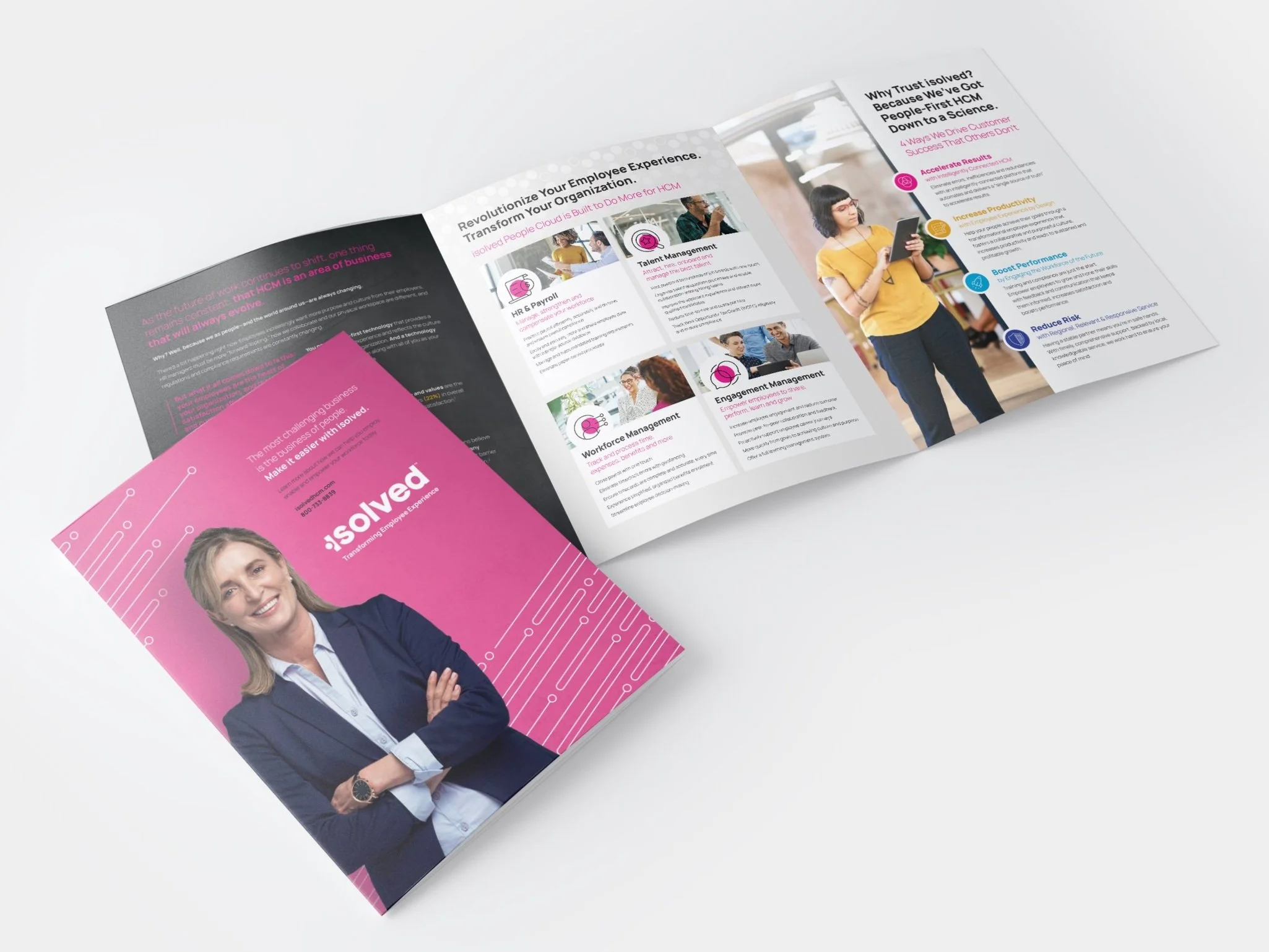
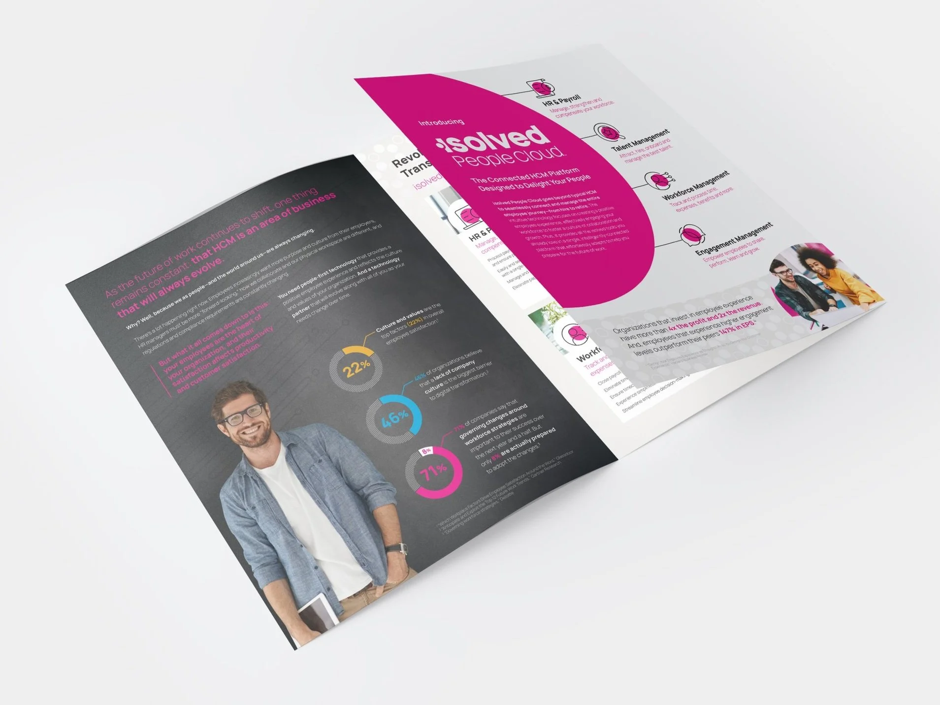
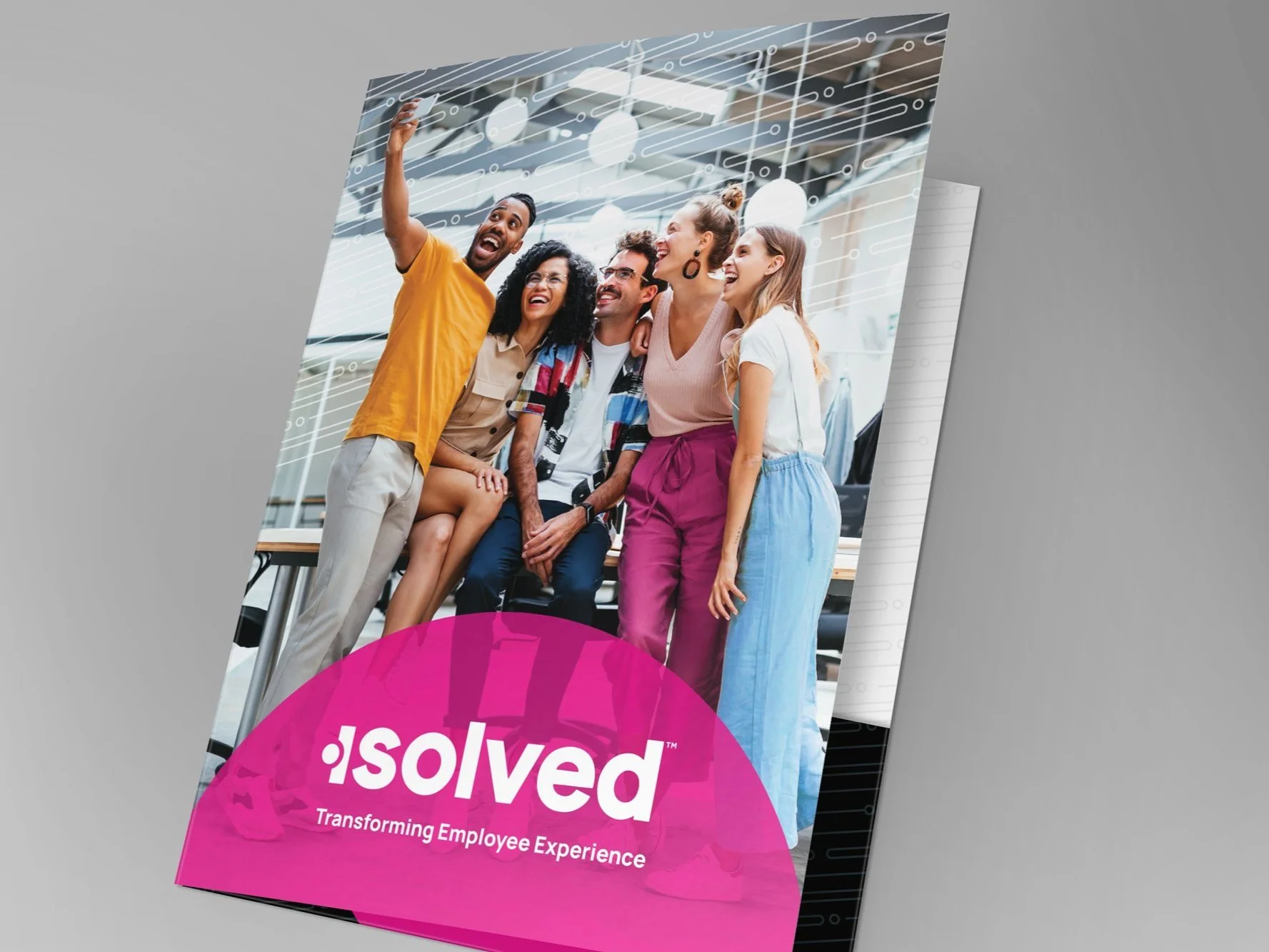
Print collateral
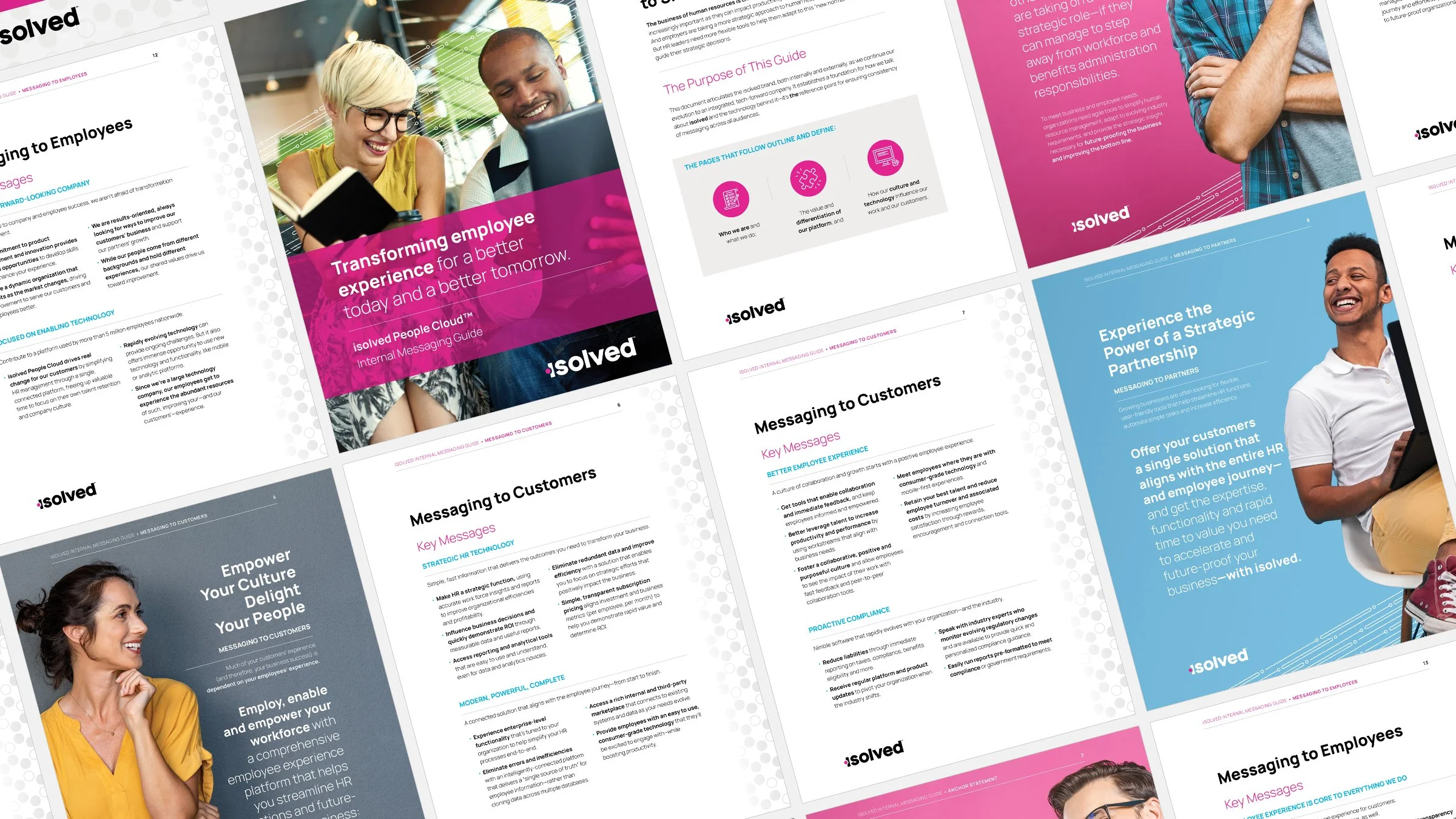
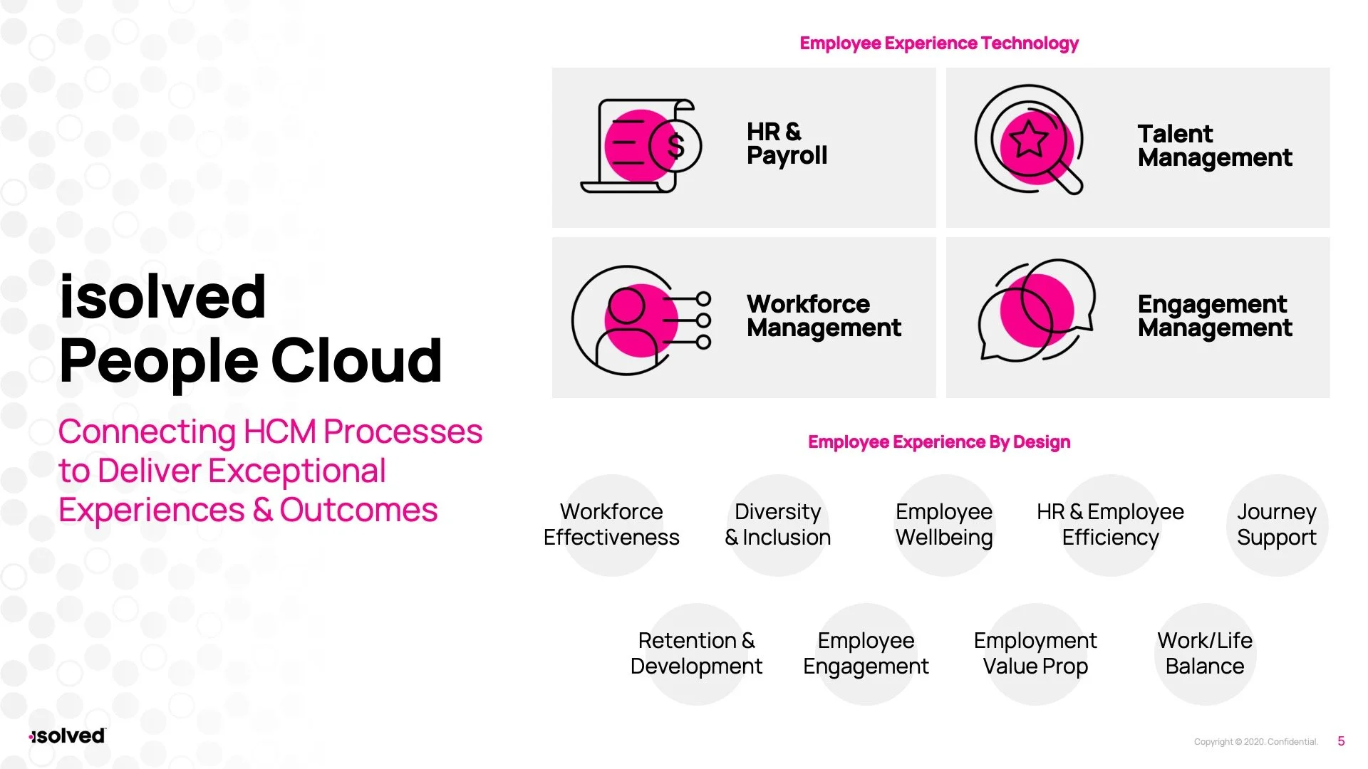
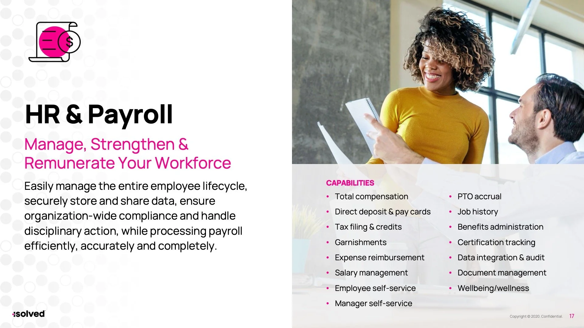
Presentation Design